

Cata - Café
Complete visual identity for a café/restaurant/bar
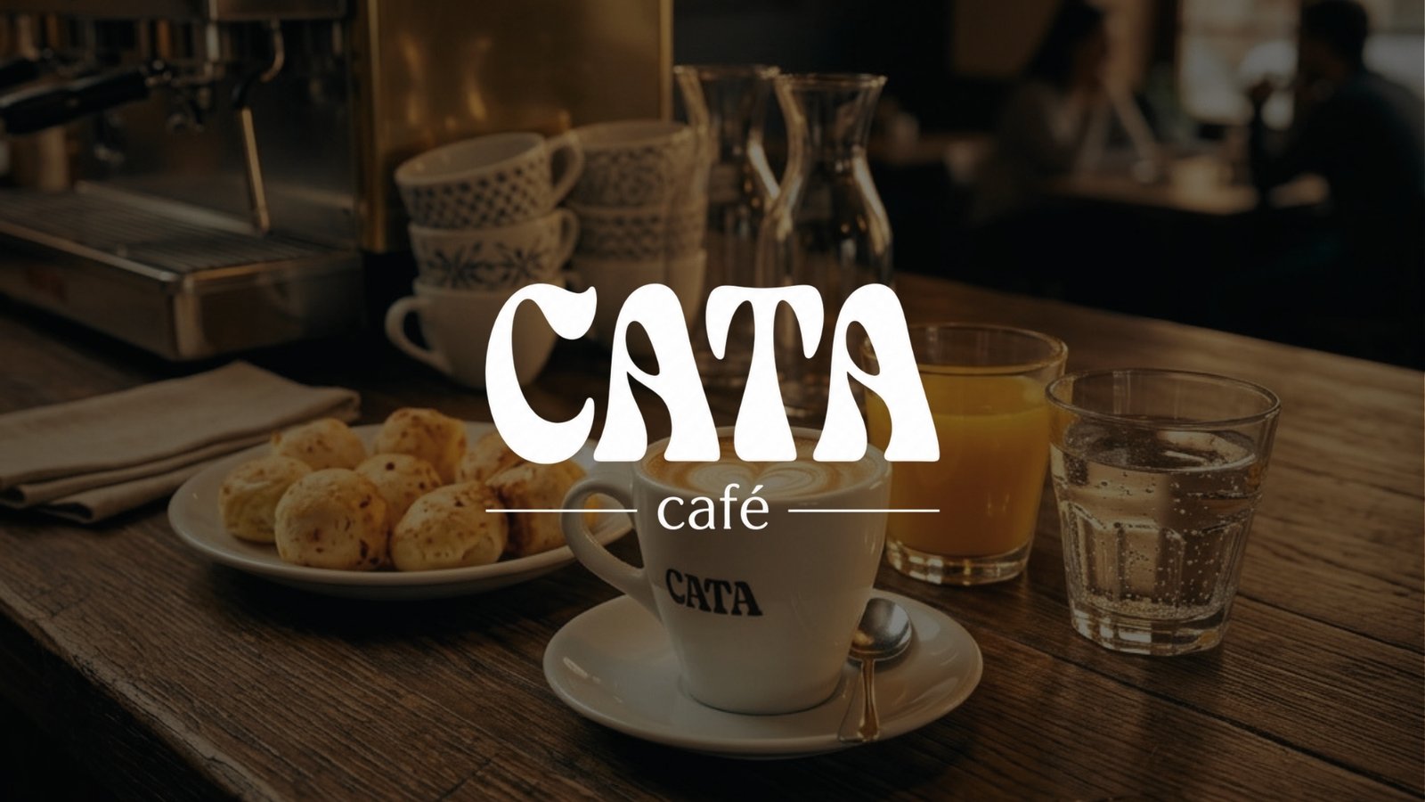
- Area
- Branding
- Year
- 2026
- Role
- Art direction
- Tools
- Illustrator, Canva, ChatGPT
- Duration
- 2 months
The challenge
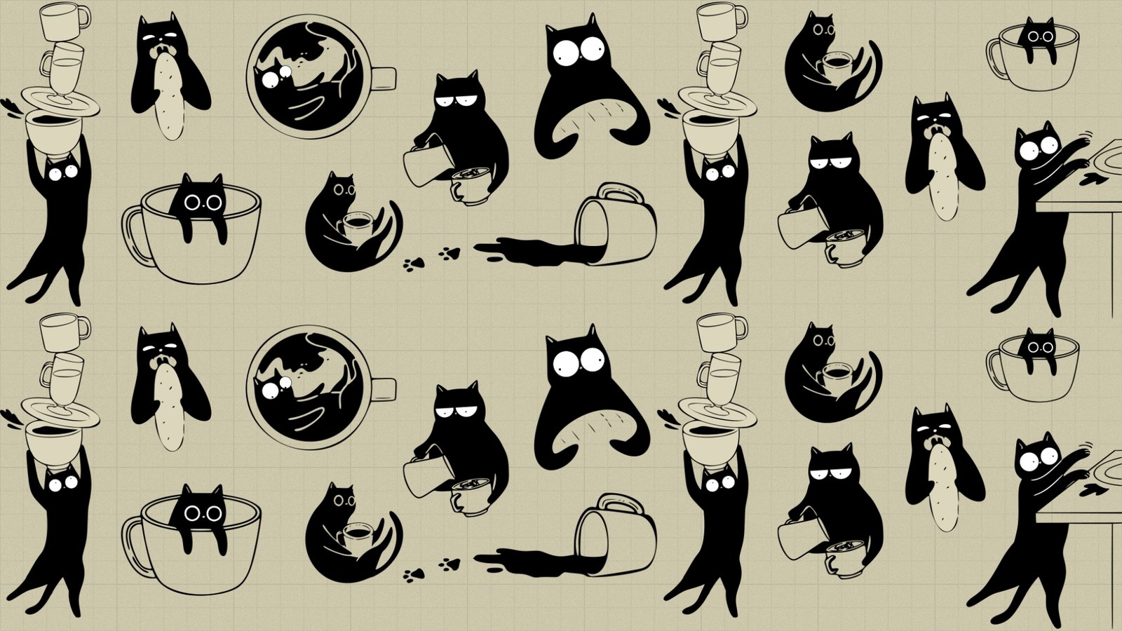
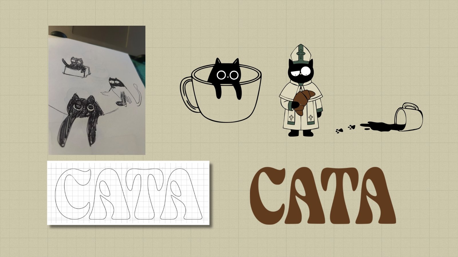
The client wanted to give Cata personality through a mascot that would become the brand's signature. Their initial idea was to include a fox, but after analyzing the communication potential of different animals, I proposed replacing it with a black cat. The choice aimed to leverage the affinity people feel for cats, their association with tenderness and their popularity in digital culture, in order to build a friendly, charming and memorable character. The challenge was to turn that mascot into a strategic identity and marketing asset, capable of setting Cata apart, creating an emotional connection with its customers and giving the brand a recognizable personality at every touchpoint.
The process
1. Research and concept: The process began by exploring different possibilities for building an identity that reflected Cata's personality. Choosing the black cat as a mascot defined the conceptual starting point: creating a friendly, playful and recognizable brand, able to connect with the audience through a character with its own charisma. From that decision, I worked on how to integrate the mascot into the café's visual universe so it could work both as a brand identifier and as a communication resource.
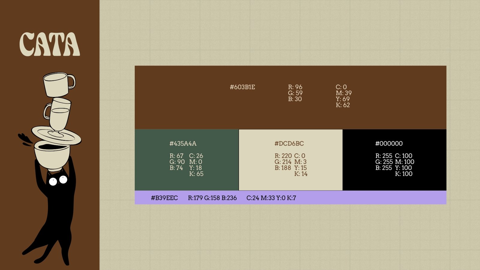
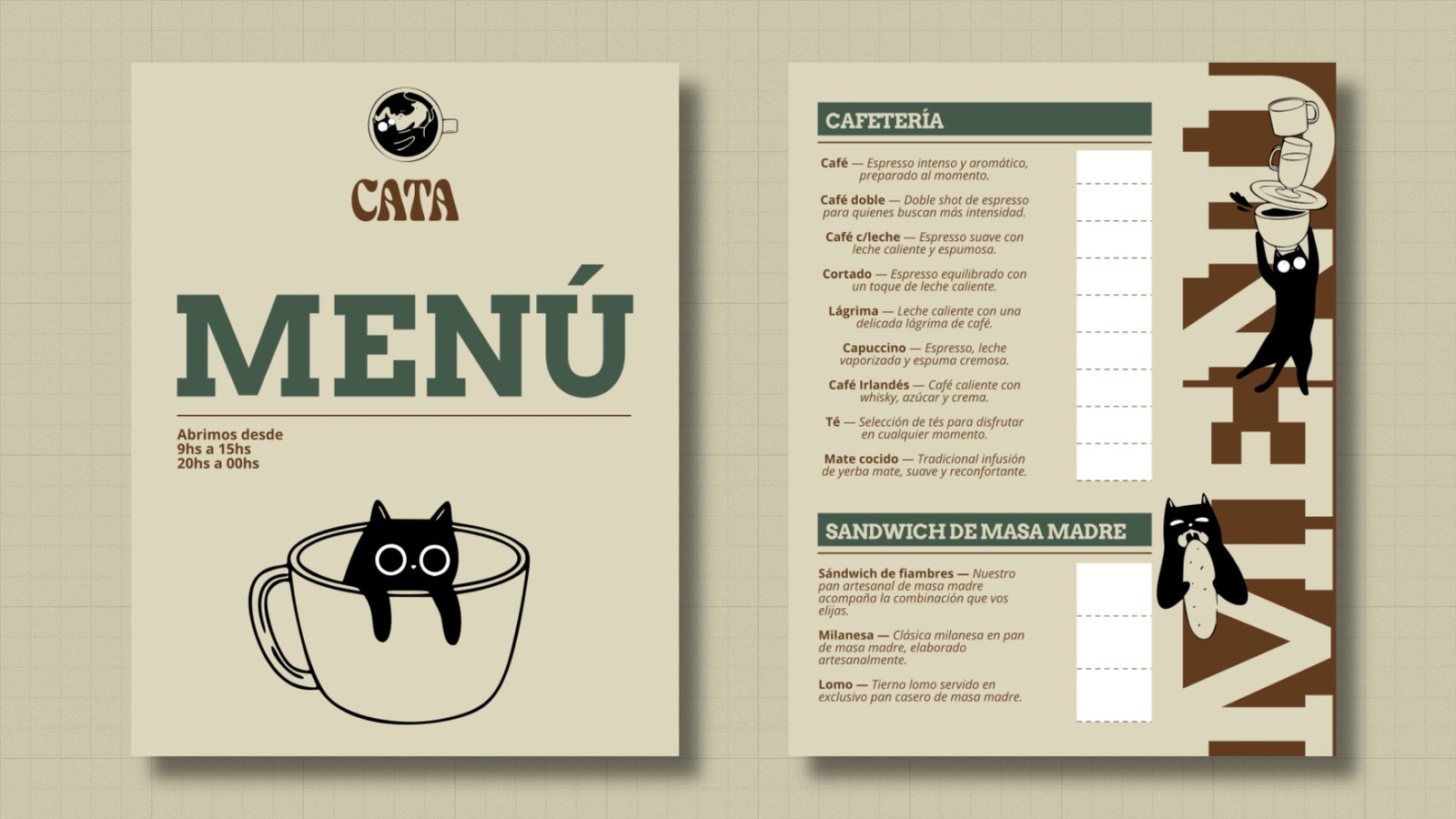
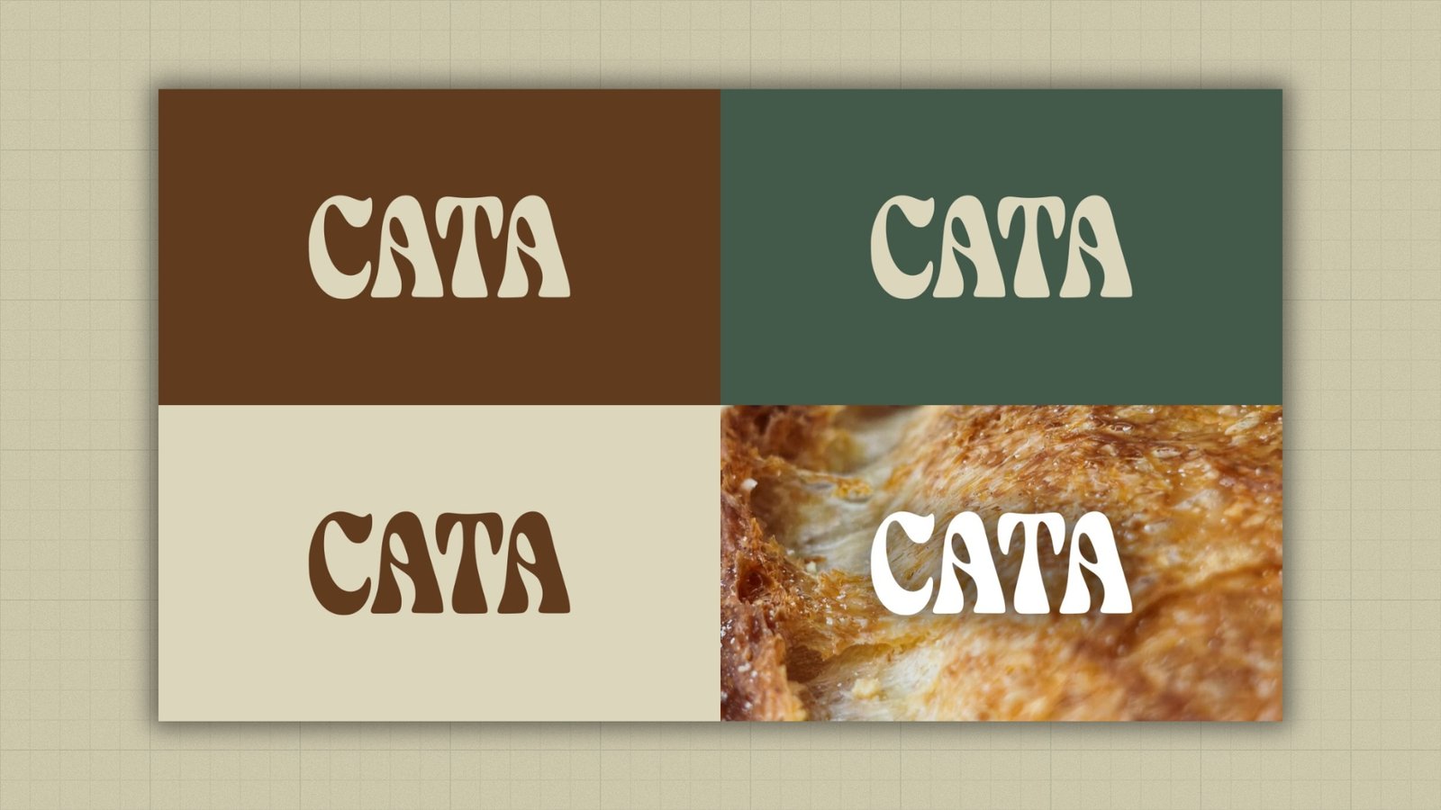
2. Visual identity and brand building: I developed a visual system that combines a handcrafted and contemporary aesthetic, seeking a balance between warmth, personality and legibility. The color palette combines dark green (#435A4A), beige (#DCD6BC), brown (#603B1E), black and lavender (#B39EEC), creating a distinctive combination that allows different shades of the identity to be explored. For the typographic system, I selected Arvo for headings and highlights, and Open Sans for text and paragraphs, combining character and expressiveness with clarity and functionality.
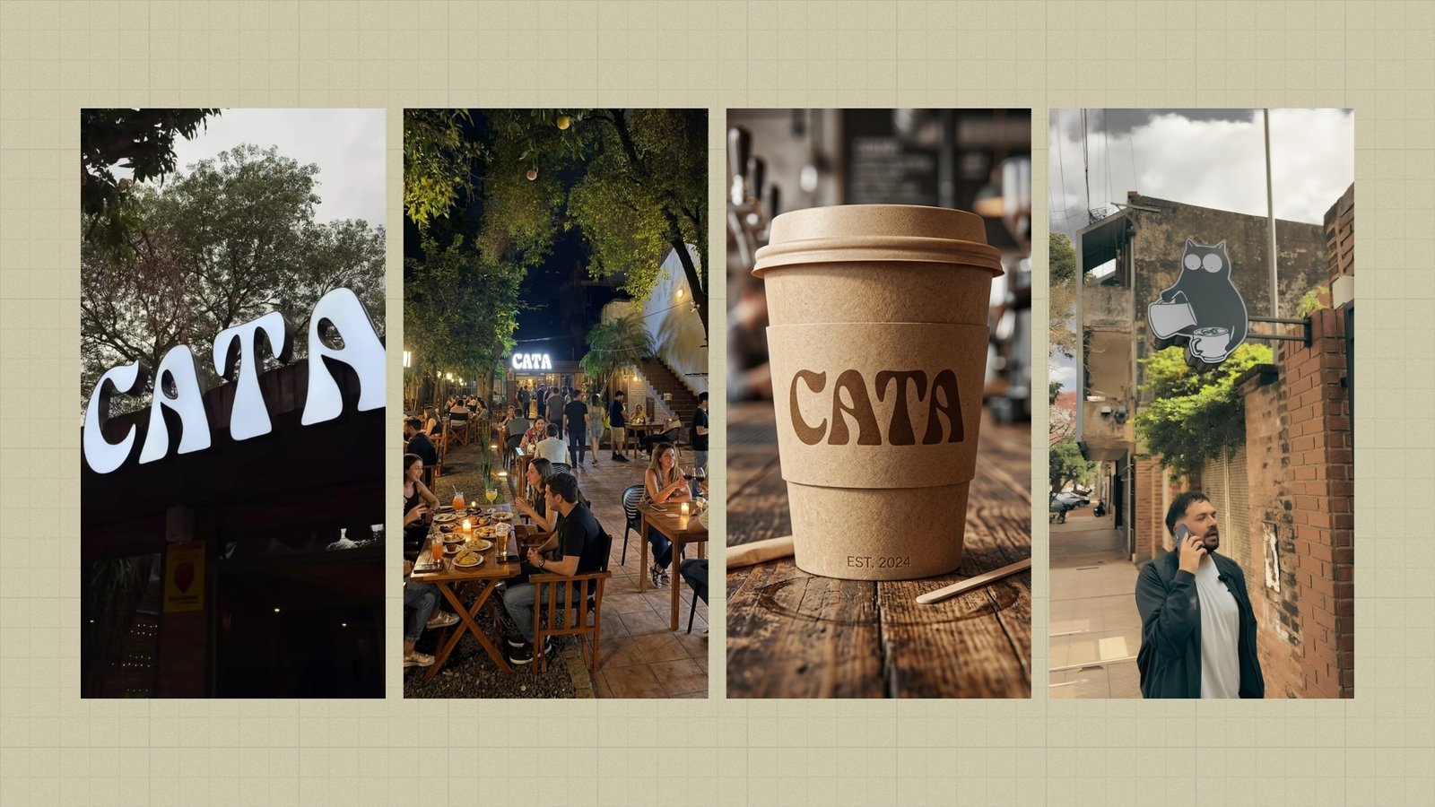
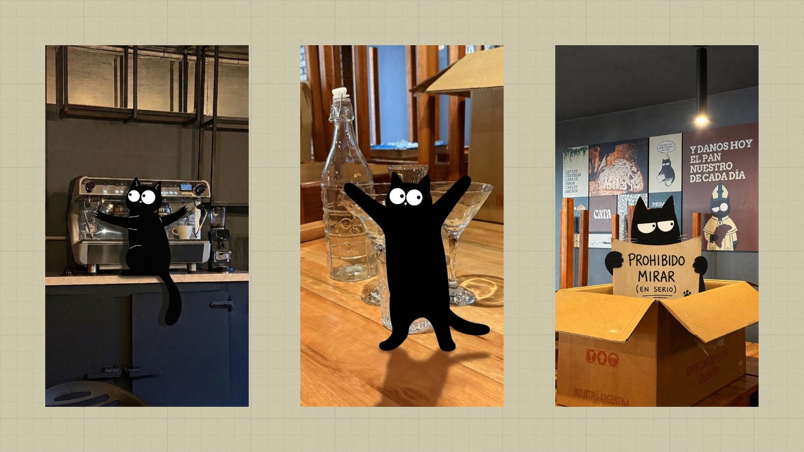
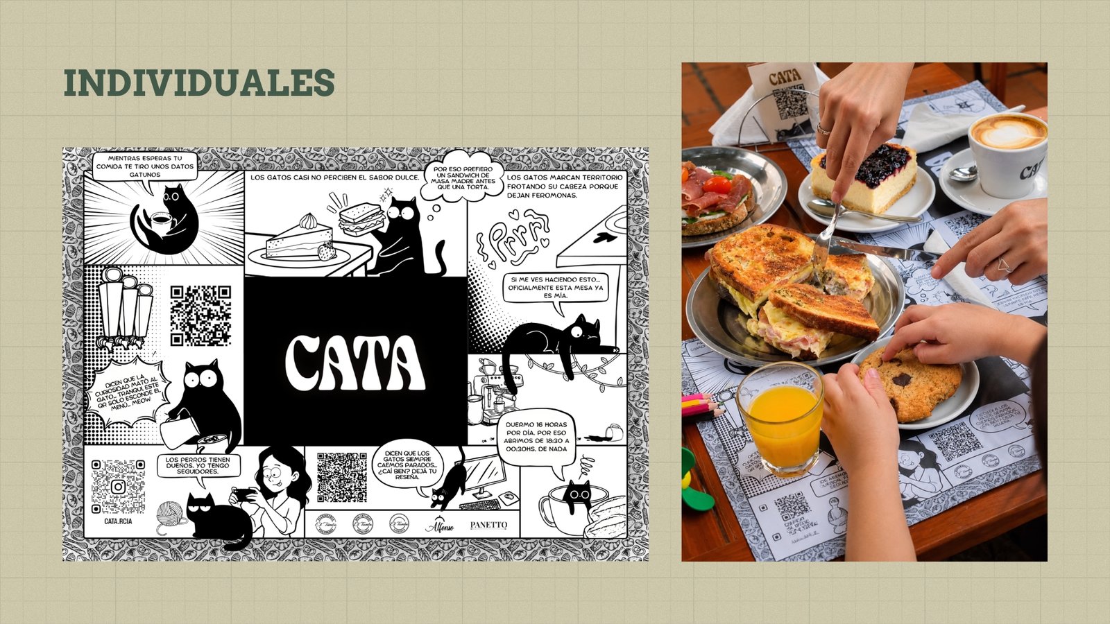
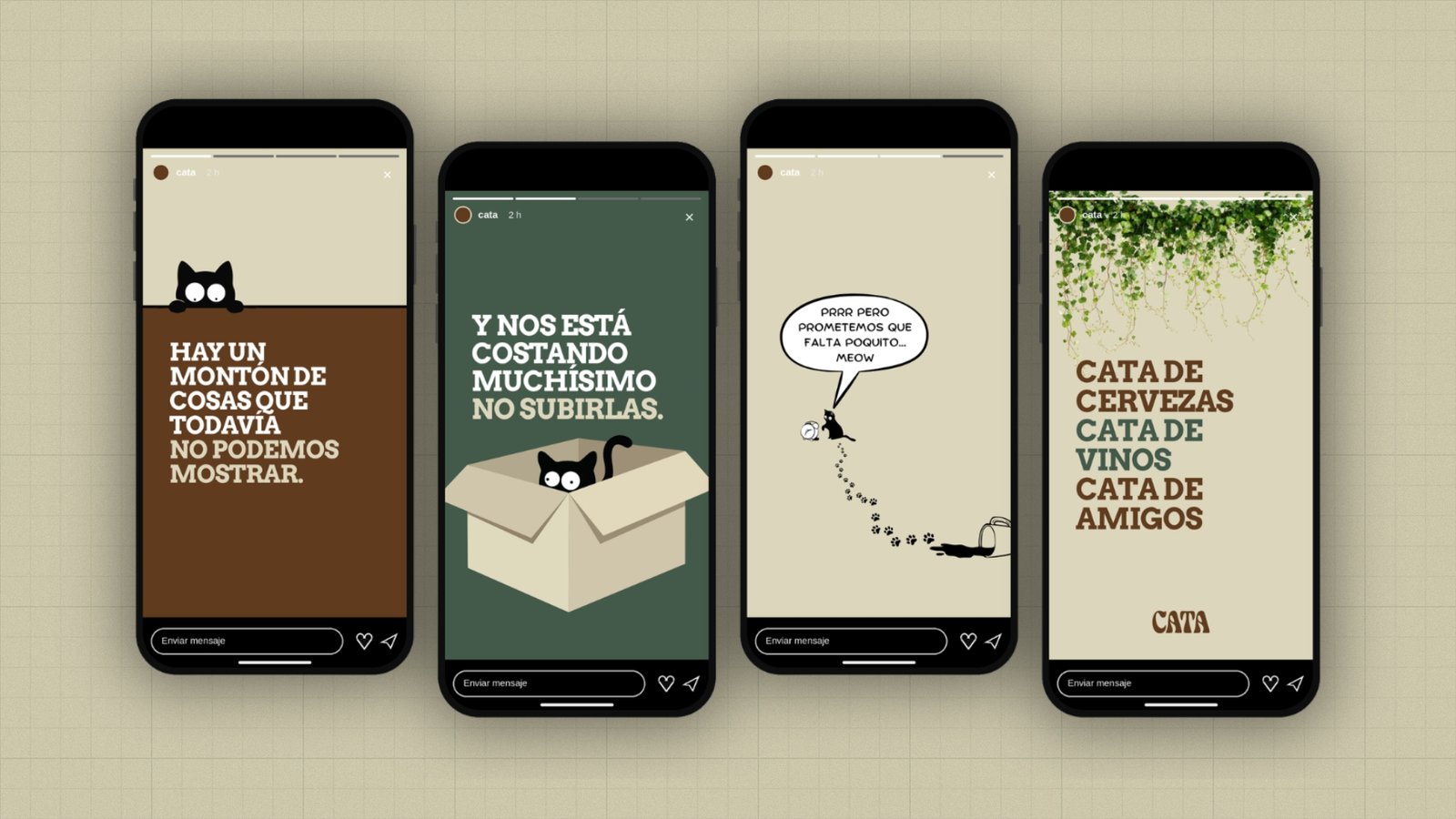
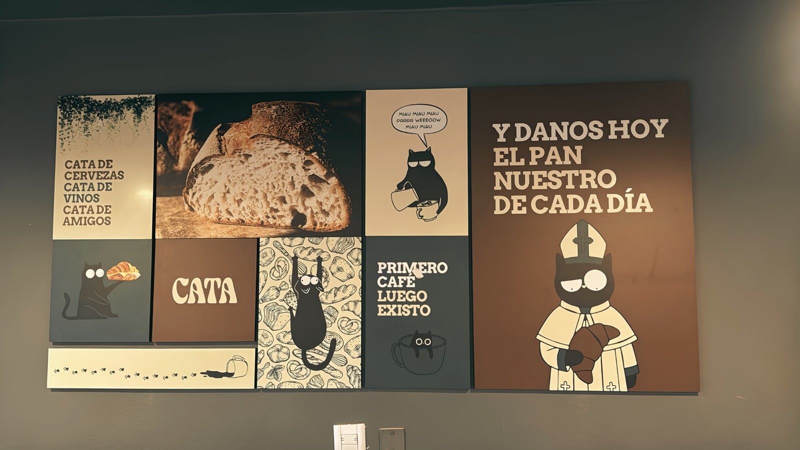
3. Applications and system exploration: Once the main identity elements were defined, I worked on how they come together and apply across different communication pieces. The goal was to test how the logo, typography, colors and mascot coexisted in different formats, keeping coherence without losing flexibility. This stage made it possible to project an identity that goes beyond visual recognition and provides resources to build a consistent brand experience, from the menu and promotions to graphic materials and products associated with Cata.
The result
The result is a visual identity with its own personality, built around a black cat that acts as the protagonist and Cata's main point of differentiation. The combination of a warm aesthetic, a distinctive color palette and a versatile typographic system makes it possible to develop a coherent, approachable and recognizable brand. Beyond its graphic identity, the project lays the groundwork for a brand universe where the mascot comes to life across communications, products and the customer experience, becoming a strategic asset for the café's positioning and marketing.