

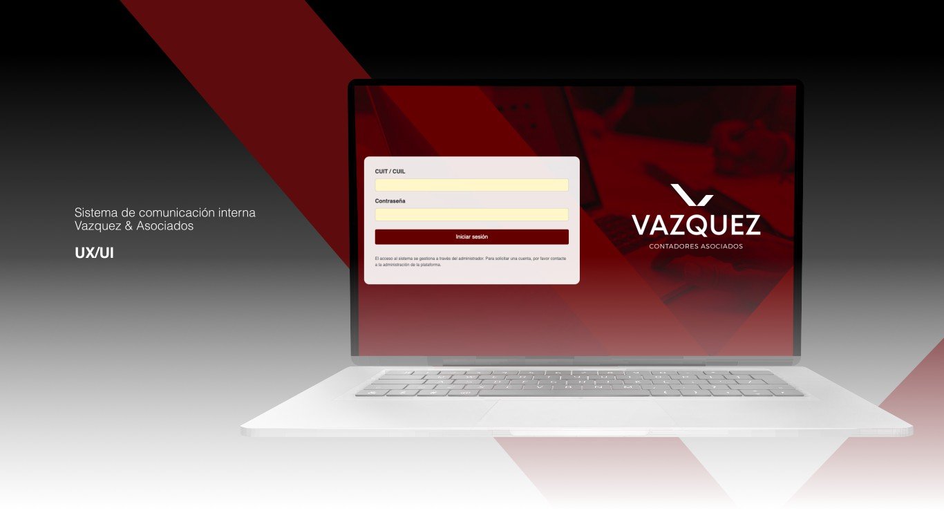
Vazquez & Asociados
Interface update for their accounting system
- Area
- UX/UI
- Year
- 2025
- Role
- Product design
- Tools
- Figma, Whimsical
- Duration
- 2 months
The challenge
How can a high-performance accounting software be optimized so it stops being slow and inefficient to operate? Despite its excellent performance and stability, the system was seriously disconnected from the real workflows of accountants and administrative staff. The interface created a lot of daily friction: from navigating through multiple screens to find basic information to an excessive number of clicks for routine tasks such as saving records or attaching documents. The goal of the redesign was to move from a system that merely 'worked' to one that multiplied productivity, drastically cutting the number of clicks and turning a tedious tool into an agile, intuitive work environment.
The process
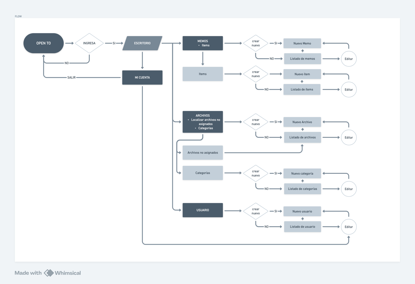
1. Field research and findings: To understand where the friction came from, I accompanied users through their daily routine and mapped their workflows. I found that the software had been designed around the limitations of the technical framework rather than people's needs. This created visual and interaction chaos: key buttons that moved between screens, unnecessary deep navigation and a constant loss of focus during repetitive tasks.
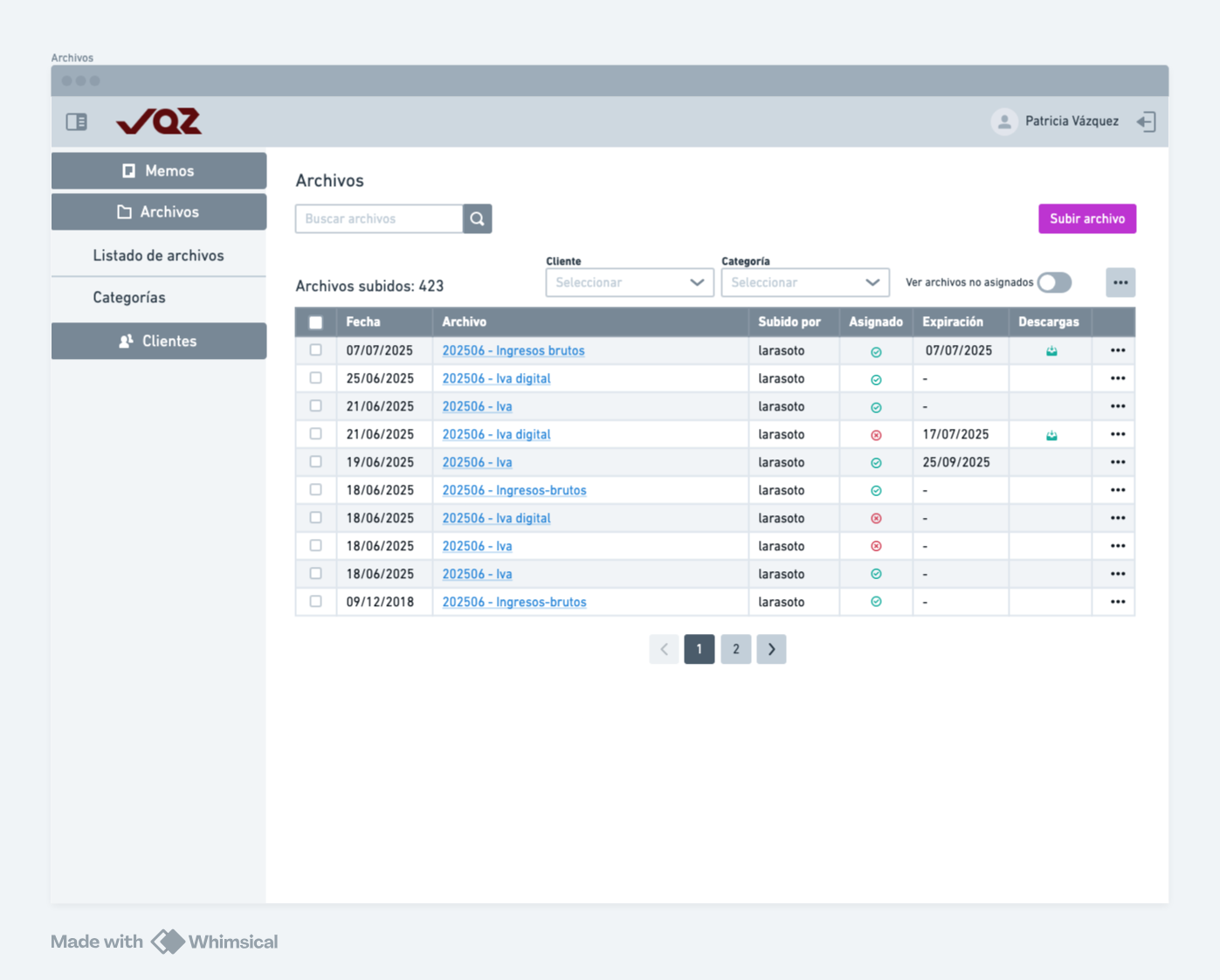
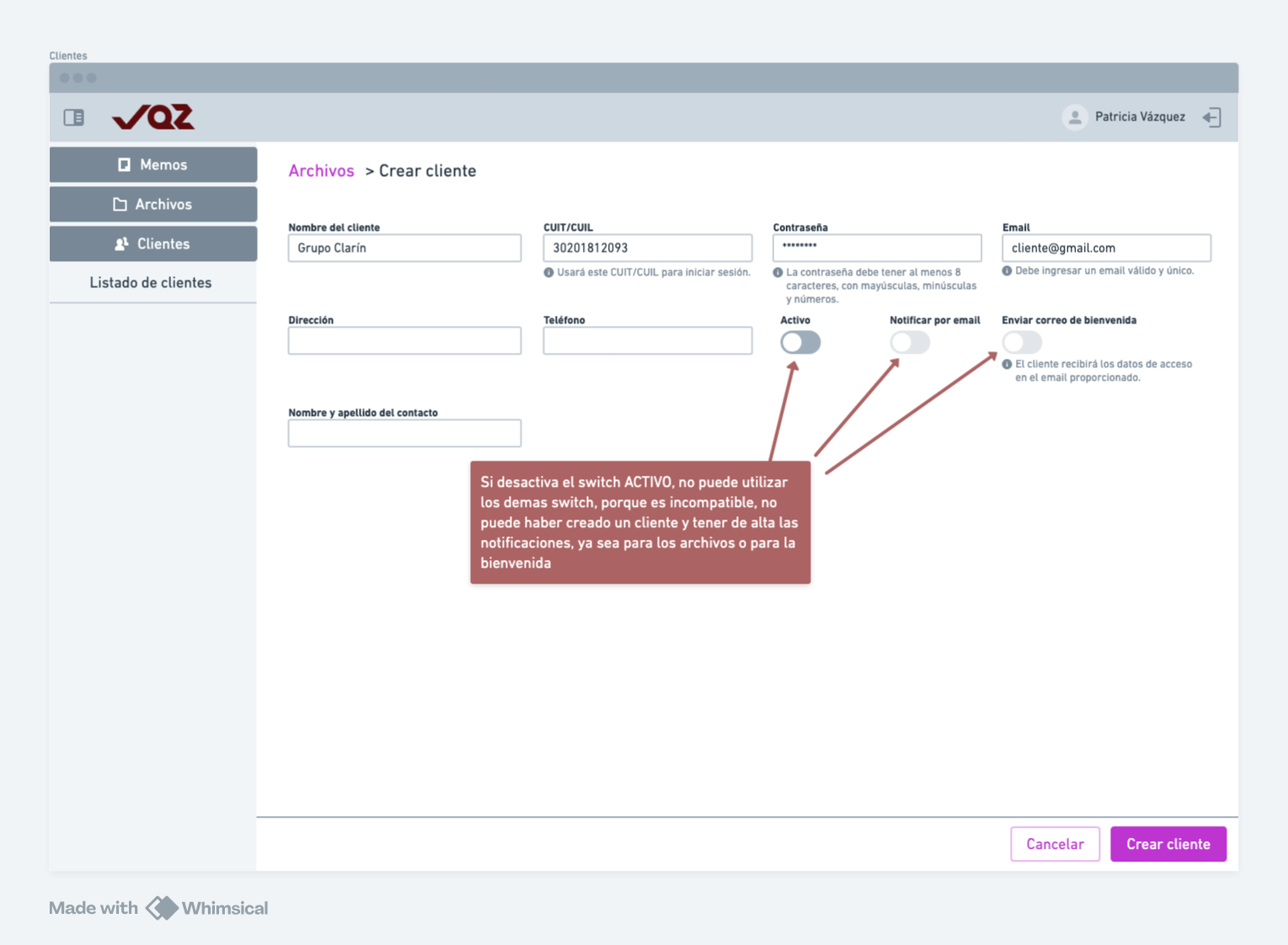
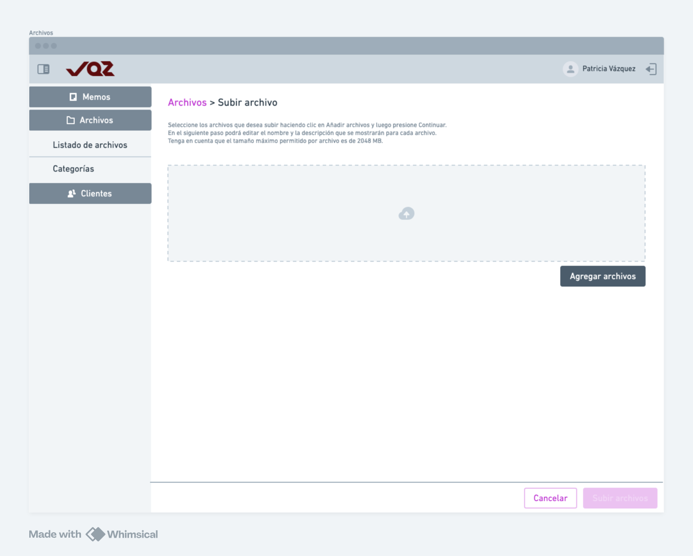
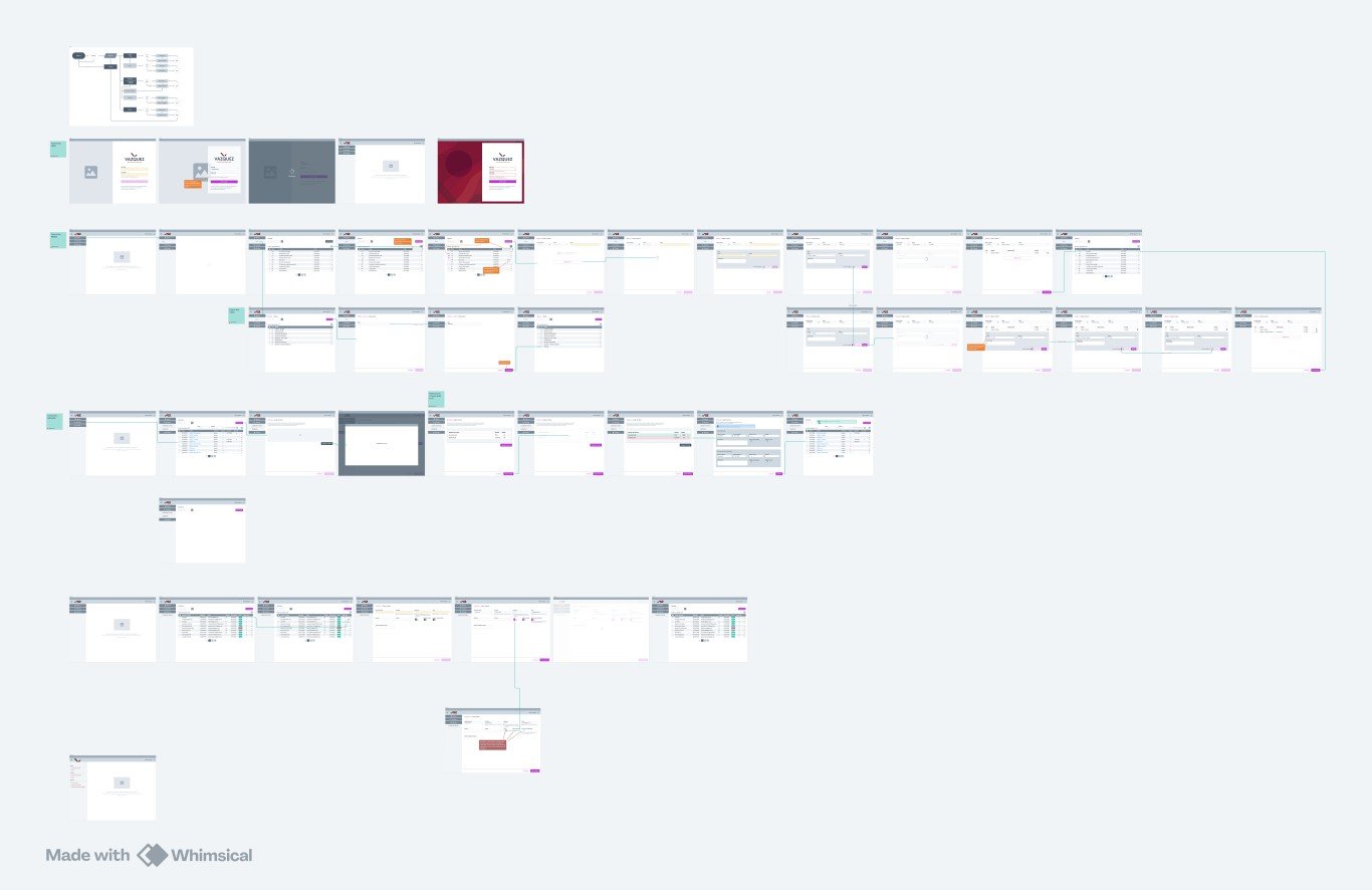
2. Cross-industry references and solution design: In response, I applied my experience with hospital management systems —a sector where precision and reducing cognitive load are vital—. I redesigned the experience around three pillars: component standardization (always-predictable actions), shortcuts for complex flows and a drag & drop file upload system that removed unnecessary confirmation clicks.
3. Validation and user testing: I tested the interactive prototypes directly with the system's operators to evaluate how intuitive the proposal was. The tests not only allowed me to adjust visual details and microcopy before development, they also confirmed the real impact of the redesign: an almost nonexistent learning curve, drastically faster flows and the complete elimination of daily operational fatigue.
The result
1. Key metrics (KPIs): The new system achieved a reduction of more than 60% in the number of clicks needed to complete the most frequent operational tasks (such as saving records or attaching documents). In addition, the average execution time of critical flows dropped dramatically, lowering the rate of data-entry errors and speeding up the learning curve for new team members.
2. User feedback: The final tests and post-launch surveys showed a radical change in how the tool was perceived. Operators highlighted the predictability of the interface ('I finally know where every button is without having to look for it') and the smoothness of file uploads, turning software perceived as 'tedious and heavy' into an agile, logical and frictionless everyday work experience.
3. Launch and implementation: I designed and integrated a standardized component system that not only improved the end-user experience but also made the development team's work easier by simplifying the scalability of new modules. The system was successfully launched in production, achieving immediate adoption without the need for lengthy training.